
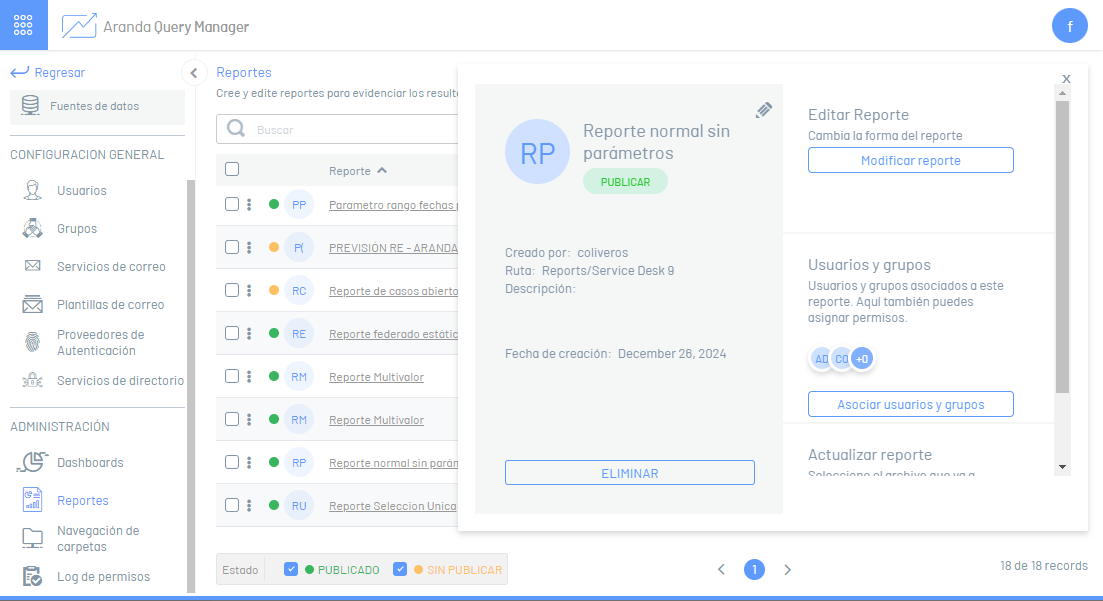
1. To access the dashboard designer, log in to the AQM web console, in the Administration from the main menu, select the Reports. In the information view, select a record from the list of existing reports, and in the detail view, click the Modify Report.
2. The report designer is enabled where you can customize the information generated. The following describes the most representative elements of the report designer and their initial scope.
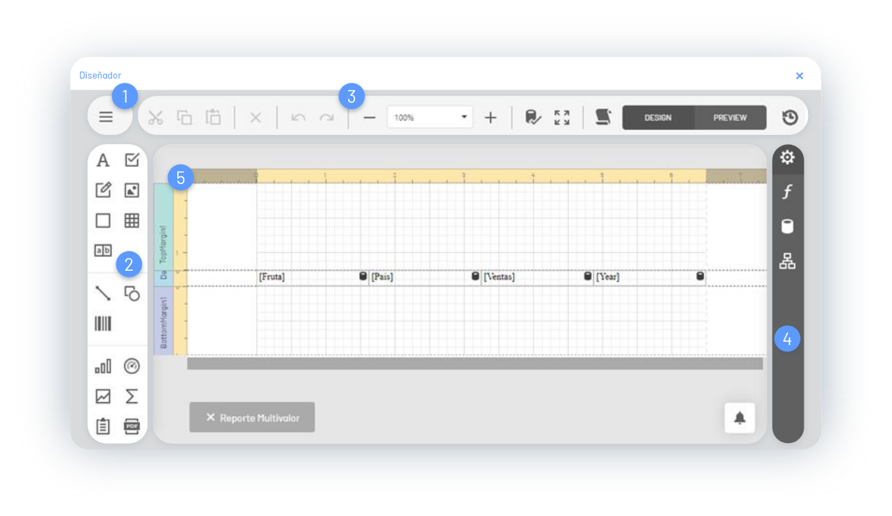
1. Report Menu
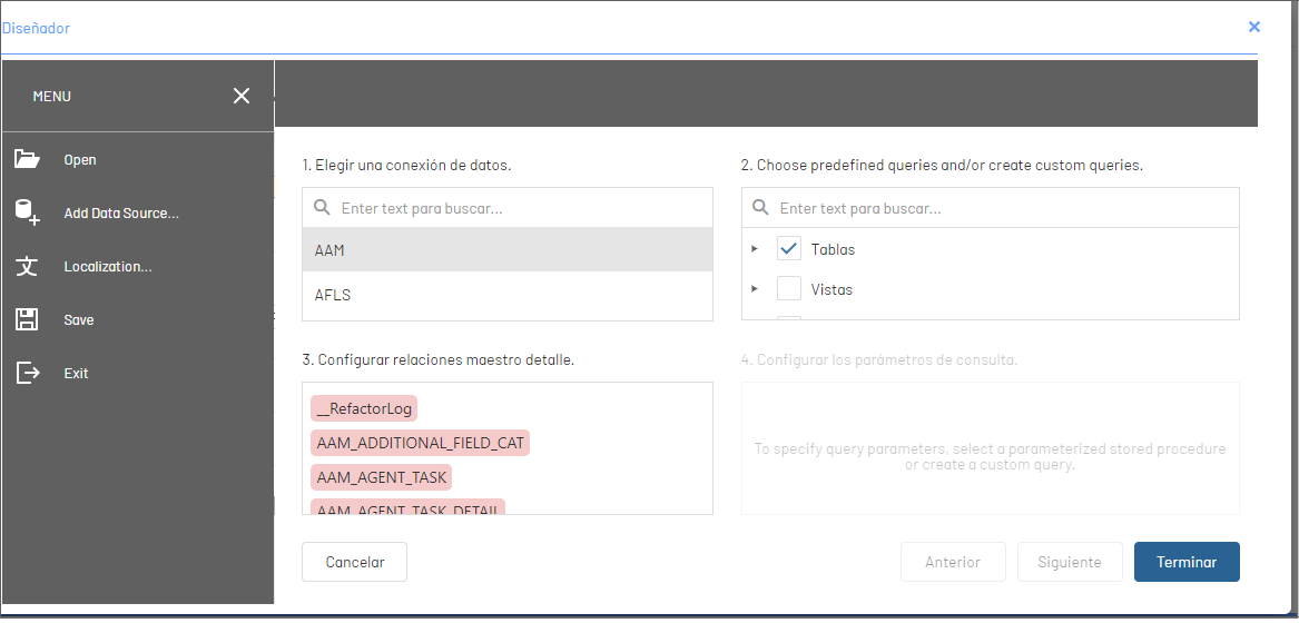
This option allows you to manage (open, save) the reports. You can customize the language of the report presentation. The most prominent feature of this menu is the management of Data Sources.
Add Data Sources: This option allows you to query or aggregate the information according to the source of the data. When selecting a record from the data source, choose a predefined query, define the master detail relationships, and query parameters.
2. Toolbar
The toolbar offers different controls to include in the report layout.
| Controls | Items | Image |
|---|---|---|
| Common | This grouping brings together layout controls such as: Labels, check box, rich text, image box, panel, table, and combo characters. | 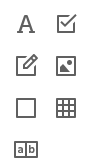 |
| Additional | This grouping brings together design controls such as: Line, Shape, Barcode. |  |
| Independent Data Source | This grouping brings together design controls such as: Table, indicators, minigraph, cross-tab, sub-report, PDF container, PDF signature. | 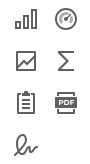 |
| Design and Auxiliary Content | This grouping brings together layout controls such as: Content Table, Page Info, Page Break, Cross-Band, and Cross-Band Box. | 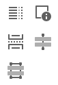 |
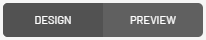
Selecting a design item from the tool group will see it reflected in the workspace, where you can customize and design the report.
3. Side Panel
After selecting an element from the report design area (band, data from a table, toolbar control), you can access the side panel where you will find design tools to customize the report and configure different features and relate information for later viewing. The Side Panel groups different options that define actions such as:
| Button | Name | Description |
|---|---|---|
 |
Properties | This option allows you to customize properties of report controls such as layout, dimensions, styles, editing options, font, padding, scripts, summary, size, text. |
 |
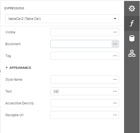
Expressions | This option allows you to assign expressions to various properties of report items. Expressions are evaluated at runtime before a document is generated. This panel option will be visible if expression bindings are enabled. |
 |
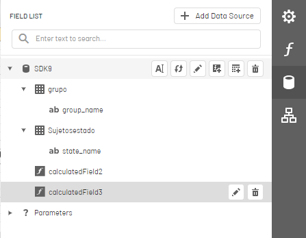
Fields | The Field List presents the schema of the report’s data sources, and you can manage the report’s data sources and parameters, add calculated fields, and create linked report controls. |
 |
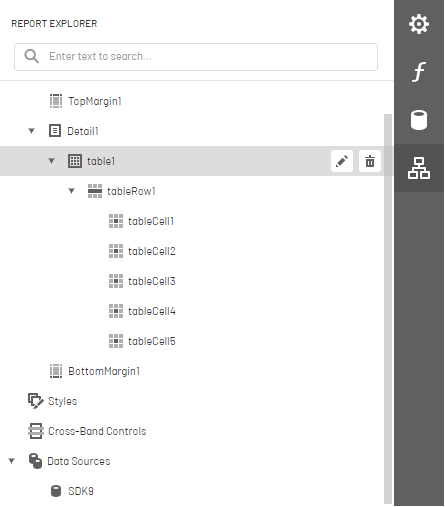
Reports Explorer | This item allows you to know the structure and configuration of the report. |
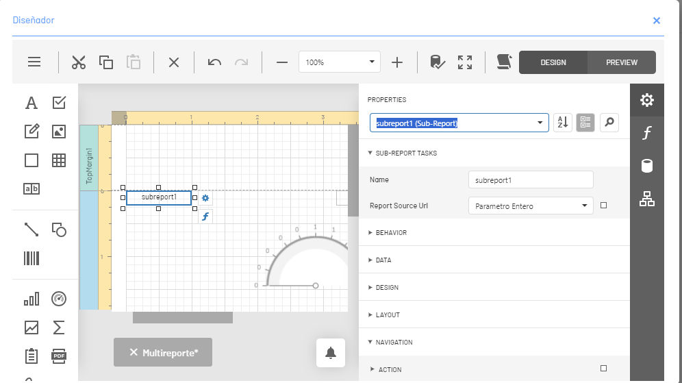
⚐ Example Side Panel/Properties: Depending on the selected report item, specific properties are enabled, where you can change the required values. This section highlights options for changing the mode of display of the information
or to access the Expression Editor
.
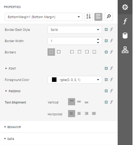
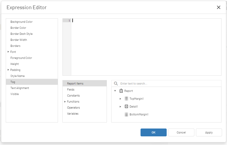
⚐ Example Side Panel/Expressions: Depending on the selected report item, specific properties are enabled, where you can change the required values. This section highlights options for consulting and customizing expressions, accessing the Expression Editor
.
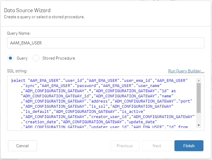
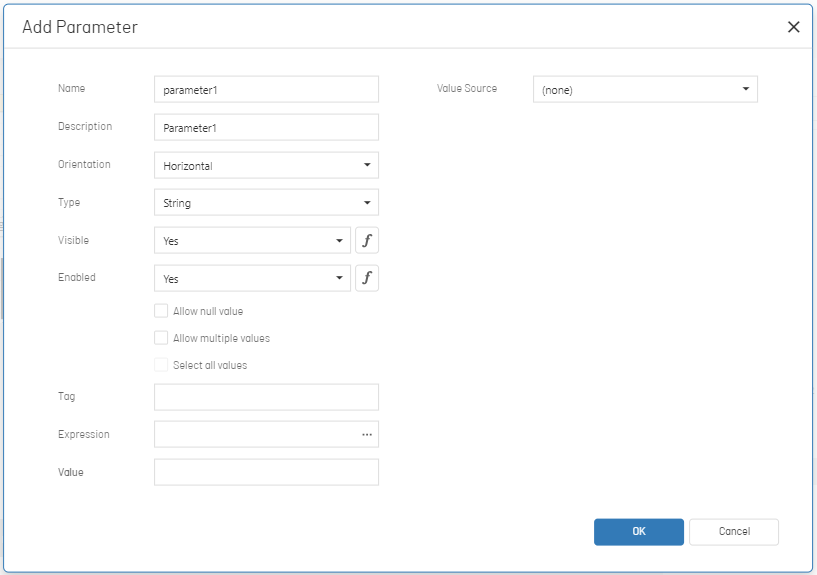
⚐ Example Side Panel/Fields: Depending on the selected report item, specific properties are enabled, where you can change the required values. This section highlights options for managing fields (rename, edit, update include field, add query or delete field)
, to add a Data Source
or to access the query builder or access the option to add or edit parameters.
⚐ Example Side Panel/Explorer Reports: This item allows you to visualize the structure and configuration of the report; Elements of the report design area such as band, toolbar controls, table data, and more. By selecting any element of the report structure, you will be able to access the editing or deletion of the component.
4. Main Toolbar
The main toolbar of the designer allows you to edit and customize the reports according to each selected control. The commands used for editing the report are:
| Button | Name Command | Description |
|---|---|---|
 |
Cut | This option allows you to cut a selected control in the report design area. |
 |
Copy | This option allows you to copy a selected control in the report design area. |
 |
Hit | This option allows you to paste a selected control into the report design area. |
 |
Erase | This option allows you to remove a selected control in the report design area. |
 |
Undo and Redo | This option allows you to undo or redo an action generated during the report design. |
 |
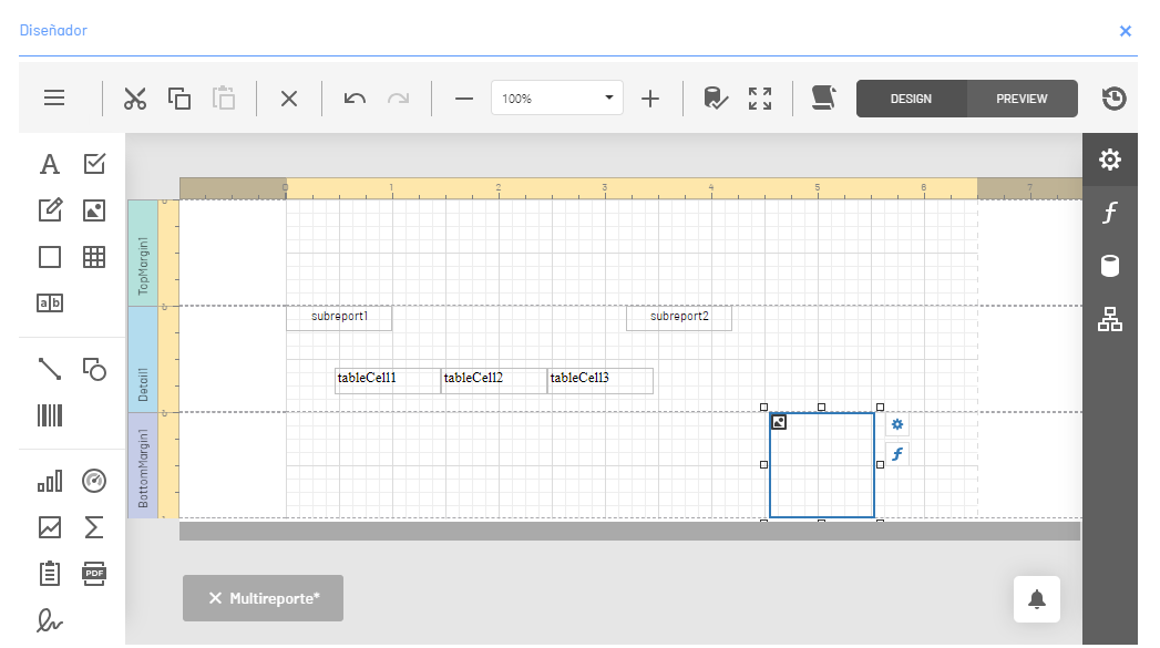
zoom | This option allows you to expand or reduce the design area of the report. |
 |
Data validation | This option allows you to highlight report controls with invalid data bindings and incorrect expressions. |
 |
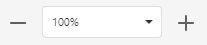
Design/Preview | These options allow you to preview the report or return to the report design view. |
 |
Waiting time | This option allows you to configure the timeout for the execution of queries in the report data sources. |
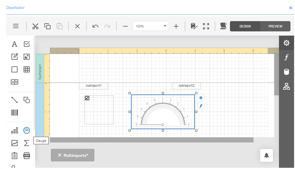
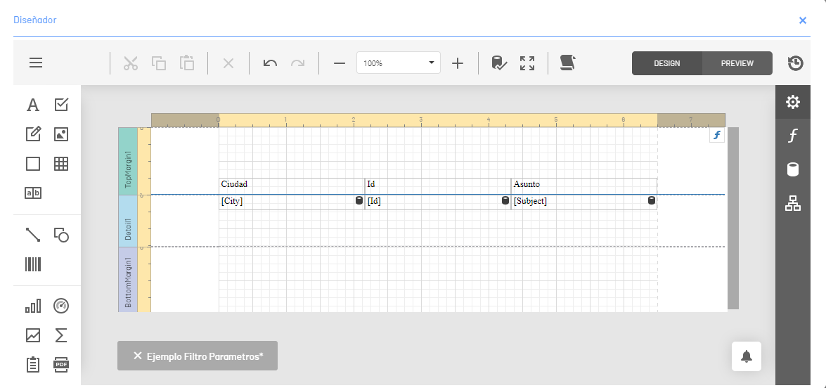
5. Designer’s Workspace
It is the workspace where the necessary elements are added, configured and designed to build a graphic proposal of a report. The most prominent elements of the designer’s workspace are:
| Element | Name | Description |
|---|---|---|
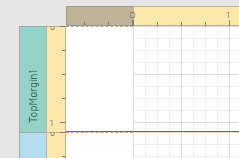 |
Rules | Horizontal and vertical rulers display check marks on the specified units of measure in the report. Click on a report item to evaluate its size and location with the rulers. |
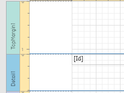 |
Bands | Each band in the report includes a title, the title of the tab, and a color, which depends on the type of band. Titles are not printed in the final report and are only visible during design. |
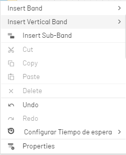 |
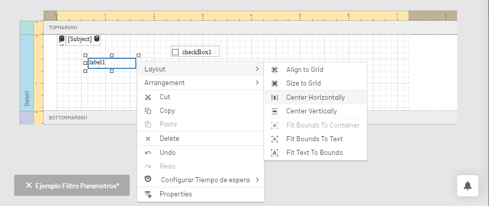
Context Menu | Context menus provide quick access to the actions of the selected item or control. Right-click a report item to open the context menu. |
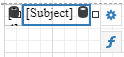 |
Smart Tags | Depending on the control of the selected report, the smart tag is enabled where you can edit the characteristics of the control or access the Expression Editor. |
⚐ Example Workspace/Context Menu: Selecting the Toolbar Label control in the workspace and right-clicking on the item enables the options available to customize the control.