
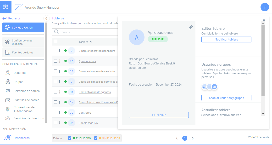
1. To access the dashboard designer, log in to the AQM web console, in the Administration from the main menu, select the Boards. In the information view, select a record from the list of existing boards, and in the detail view, click the Modify Dashboard.
2. The dashboard designer is enabled where you can customize the information generated. The most representative elements of the board designer and their initial scope are described below.
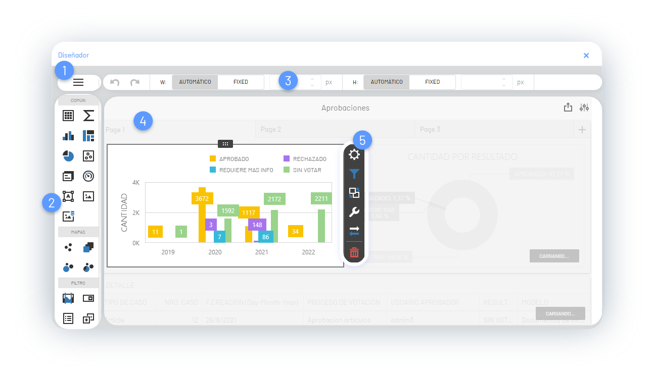
1. Dashboard Menu
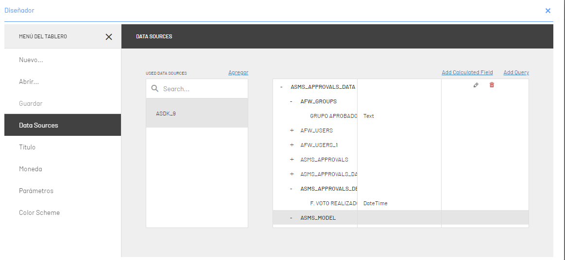
This option allows you to manage (open, create, save) dashboards; You can define board titles and colors. The most prominent feature of this menu is the management of Data Sources and the configuration of parameters.
Data Source: With this option you can add or access a data fund, create a query using the stored data.
2. Toolbar
The toolbar offers different options for the layout of the board where they stand out
| Groups | Items | Image |
|---|---|---|
| Common | This grouping brings together design items such as: Tab-Cube-Graph, TreeMap, Pies, Scatter Charts, Tabs, Gauge, Text Box, and Bound Image. | 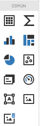 |
| Maps | This grouping brings together design items that present the information using georeferencing elements such as maps: Geo Point Map, Choropeth Map, Bubble Map, Cake Map. |  |
| Filter | This grouping brings together design items to filter information, such as: Range filter, combo box, list box, tree view, and data filter. | 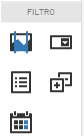 |
| Design | This grouping brings together design items such as group and tab container |  |
| Customized | This grouping brings together customized design items such as: Online map, webpage, kpi number, donut, kpi icon, circular gauge, linear gauge, bar gauge, just gauge, kpi icon bar, extreme chart, funnel chart | 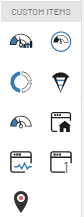 |
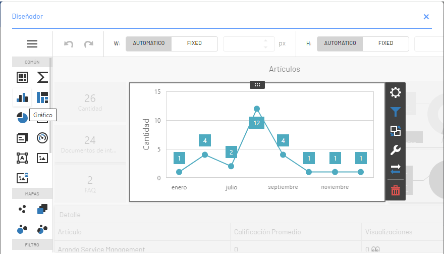
Selecting a design item from the tool group will see it reflected in the workspace, where you can customize it using the options in the Item Menu.
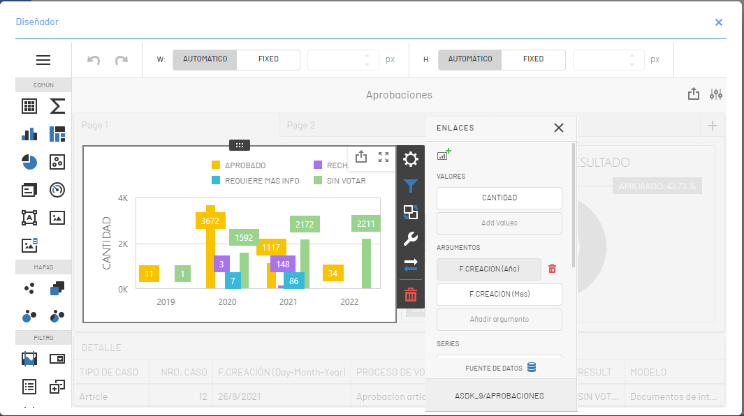
3. Item Menu of Boards
The Item menu presents the design tools for customizing a dashboard and configuring different features and relating information for later viewing. The Item menu groups different buttons that define actions such as:
| Button | Name | Description |
|---|---|---|
 |
Move | This option allows you to customize the design of the item, enlarging or restoring the size of the board in the workspace. |
 |
Links | This option allows you to create and modify the links and relationships with the data sources of the item of the selected board. |
 |
Filters | This option allows you to apply filters to an item on the board. |
 |
Interactivity | This option contains settings affected by interaction between multiple items on the board. |
 |
Options | It allows you to define and configure common characteristics of the dashboard. Settings such as legend, format. indicators, colors, among others. |
 |
Convert to | This option allows you to convert or duplicate the current board to items of the common grouping, such as grid, tokens, indicators; as well as items from other groups such as maps or filters. |
 |
Eliminate | This option removes the item from the dashboard from the designer’s workspace. |
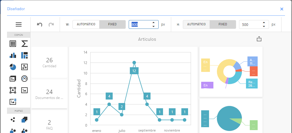
4. Designer Toolbar
The Designer Toolbar allows you to customize the display of boards with respect to their size.
5. Work Area
It is the workspace where the necessary elements are added, configured and designed to build a graphic proposal of a board.