
The App Metrics Dashboard is intended to present consolidated statistical information related to mobile app usage and mobile data consumption.
The dashboard is aimed at providing information about productivity in relation to the use of applications marked as productive.
Each of the items in the App Metrics dashboard is detailed below.
Main filter
This filter presents drop-down lists corresponding to the month and year in which you want the charts for each of the dashboards to be filtered. The values loaded in the drop-down lists correspond to what exists in the database reported by the devices in relation to application data usage and consumption.
Productivity Dashboard
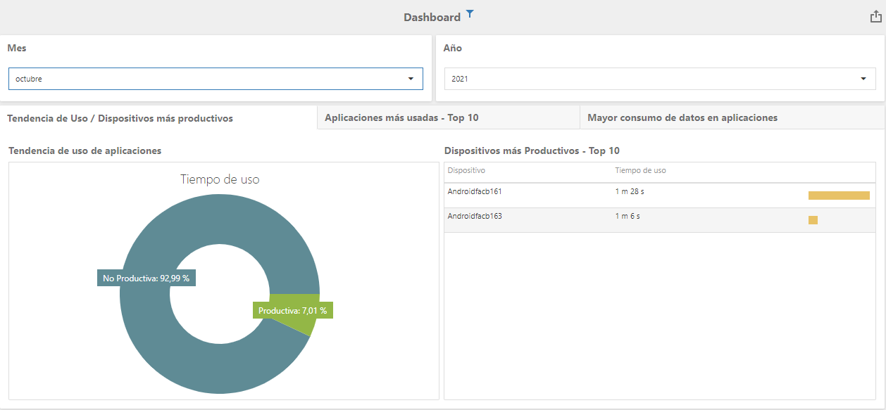
Two elements are presented:
Circular Diagram of Productive Use
This diagram compares the use of productive versus non-productive applications, in percentage
List of Productive Devices
A Top 10 of the devices with the most use of applications marked as productive is presented.
Most Used Applications Dashboard
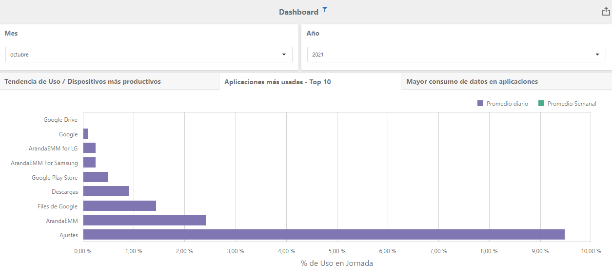
A bar chart is presented ordered from lowest to highest of the most used applications with daily and weekly averages.
Application Data Consumption Dashboard
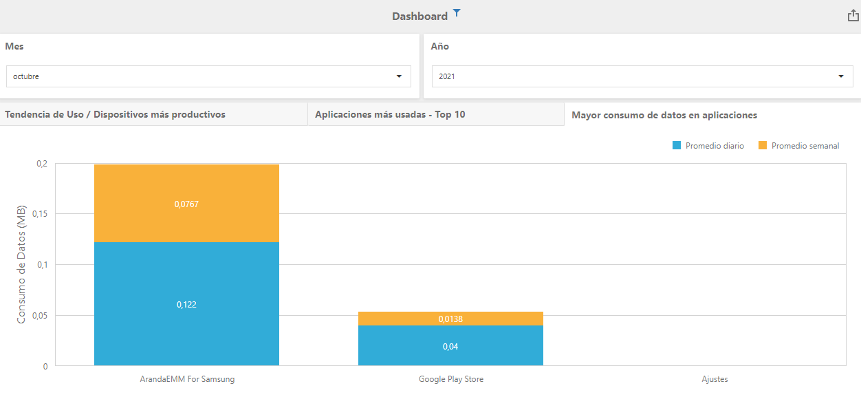
A histogram ordered from highest to lowest of the applications with the highest data consumption is presented, in weekly and daily averages.